


Mobile App Redesign
for a Green Energy Provider
My role
Lead Product Designer
Jan 2019 – June 2019
Methods and tools used: User research, interview experts, user journey mapping, SWOT, competitor research, audit of existing app, ideaisation, solutionising, flow diagrams, wireframing, prototyping, usability testing, IA mapping, visual design, UI design, component library, speccing components, animation, stakeholders management.
Overview
Ecotricity is a green energy provider built on the principle of heavily reinvesting its profit in to building more green energy infrastructure (e.g. windmills, sunmills) and creating a sustainable future. I was approached by Ecotricity to work with their in-house team to completely redesign their customer facing mobile app for iOS and Android.
Project Aims:
- Enable customers to effortlessly perform key tasks such as submitting meter readings and viewing bills,
- Identify and implement efficiencies (money and time) for Ecotricity and it’s customers,
- Create a look and feel which leads the way for Ecotricity’s digital platforms,
- Explore avenues for the app which might allow customers to be more environmentally friendly,
- Allow Ecotricity to show news and important updates to their customers.
The Approach
The project started with an initial 12 week Discovery Phase and then switch to an ongoing Design and Delivery Phase, with the team gradually changing from UX led through to UX/UI/development led.
6 week Discovery Phase
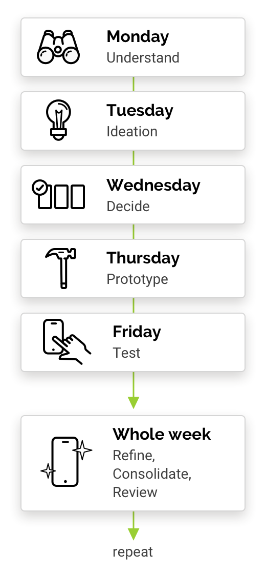
6 Sprints: Adoption of Google’s sprint model based around rapid researching, prototyping and testing. Each sprint looking at main areas of the business.
Team: Product Owner, Product Design Lead (me), UX Designer, Graphic Designer, Technical Analyst
Ongoing Design & Delivery Phase
Ongoing agile sprints: Amalgamating all of the ideas so far, evolving them, exploring some other ideas and then bringing it all together in order to design the app as a whole and build it. This phase also allowed for reviews with experts and stakeholders and further usablity testing.
Team: Product Owner, Product Design Lead (me), 7 developers. Additional input from UX Designer and graphics, marketing and compliance departments.
Discovery Phase
For the Discovery phase, we went through 2 week sprints with each sprint focussed on a different area of the business: billing, payments, meter reads, debt management and customer services. The first week the sprint was based on Google’s sprint model and was aimed at understanding an area, identifing issues and oppourtunities, solutionising, prototyping and then testing. I then used the second week to improve solutions and prototypes based on testing results, think holistically about how all the solutions to date can compliment eachother, perform additional UX tasks (e.g. audit of current app, competitor research, creating flows, creating a sitemap, etc.), and to run findings and prototypes past the experts, stakeholders and developers.

Initiate workshops & speak to experts
Workshops were held in which I interviewed senior stakeholders and experts from multiple departments including billing, payments, debt management, customer services and marketing. This allowed me to really understand processes, data, experiences, and to identify the main problems for customers and Ecotricity, the impacts of those problems, what’s going well, opportunities being missed, etc.
While doing this, I created user journeys, established sprint goals, conducted SWOT analysis, listed “how might we”s, conducted competitor/market research and more.
“Customers need to clearly see how previous meter readings and payments have fed in to a current outstanding amount so that they instantly feel confident that it is the correct amount.”
Problem Statement, Sprint 3
Understand existing journeys
I created user journeys for the most common scenarios that customer’s were currently experiencing. Interviewing experts allowed me to refine these user journeys while gaining in-depth understandings of where the biggest strengths, weaknesses and opportunities were. There were many variants of each journey to encompass numerous payment methods, meter types, whether in arrears or not, single vs multiple properties, etc. These user journey maps helped to not only understand the journeys, but also to easily identify overlapping common issues and opportunities. It soon became evident that concentrating on issues early in the journeys should create a much smoother and pleasant experience further along for customers and numerous Ecotricity stakeholders.

Ideation & Storyboarding
Next up, I lead the team in mapping out ideal flows, brainstorming and scamping out ideas. We then identified the best concepts which I would merge and evolve while looking at how they might work holistically with other areas of the product. I then brought it all together through wireframes and storyboards in to something that could be built as a prototype for further testing.
I would also make note of any small little ideas here and there that I thought were promising and which could be explored later, for example, the ability to add “when your meter reading is due” to the device’s calendar. I always make an effort to keep note of ideas for post-MVP when going through the discovery phase of a project.
Rapid Prototyping
I used UX Pin to create prototypes for testing. It was a great tool for making interactive prototypes as it could provide different onward journeys depending on what users enter in to fields, and it also provided lots of support for animations which was important to the designs.
The prototypes were very rough with not much love going in to the visuals yet. Sometimes the prototypes would be their own individual ones, other times I would build on top of what had already been made to see how different solutions might work together.


User Testing
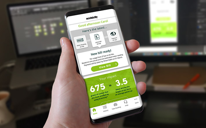
With a prototype built, I would dedicate a day in each sprint doing usability testing on 5 or 6 members of the public. We tried to to get people that considered themselves environmentally friendly to reflect Ecotricity’s market.
This was also a great opportunity to build up knowledge about people’s thoughts and use of mobile devices, apps and green energy and also to understand any of their efforts to be environmentally friendly.

Improving
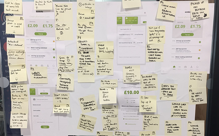
Usability testing would be followed up by a week in which I would group comments, identify common themes, review and prioritise with the UX designer, then use all that feedback to improve the prototype and the ideas that we have. When doing this, I would try to think holistically about how this prototype might work alongside other features that we have already built or that are on the horizon. This was often a good opportunity to run our prototypes and findings through the experts within Ecotricity for their feedback, and also to show the designs and findings to senior stakeholders.
Additional UX research
During the Discovery Sprints I also initiated additional UX tasks including:
an audit of the existing Ecotricity app,
analysis of app store reviews for the existing app,
flow diagrams for certain journeys in the existing app,
liaising with developers and analysts to work out possibilities and technical constraints from the back end systems,
researching available data that we might be able to exploit,
identifying all sections and components of the app that would be needed, such as screens for onboarding, screens for multiple account holders (e.g. landlords), error states, loading states, the offline experience, etc.

The Production Phase
Sitemap
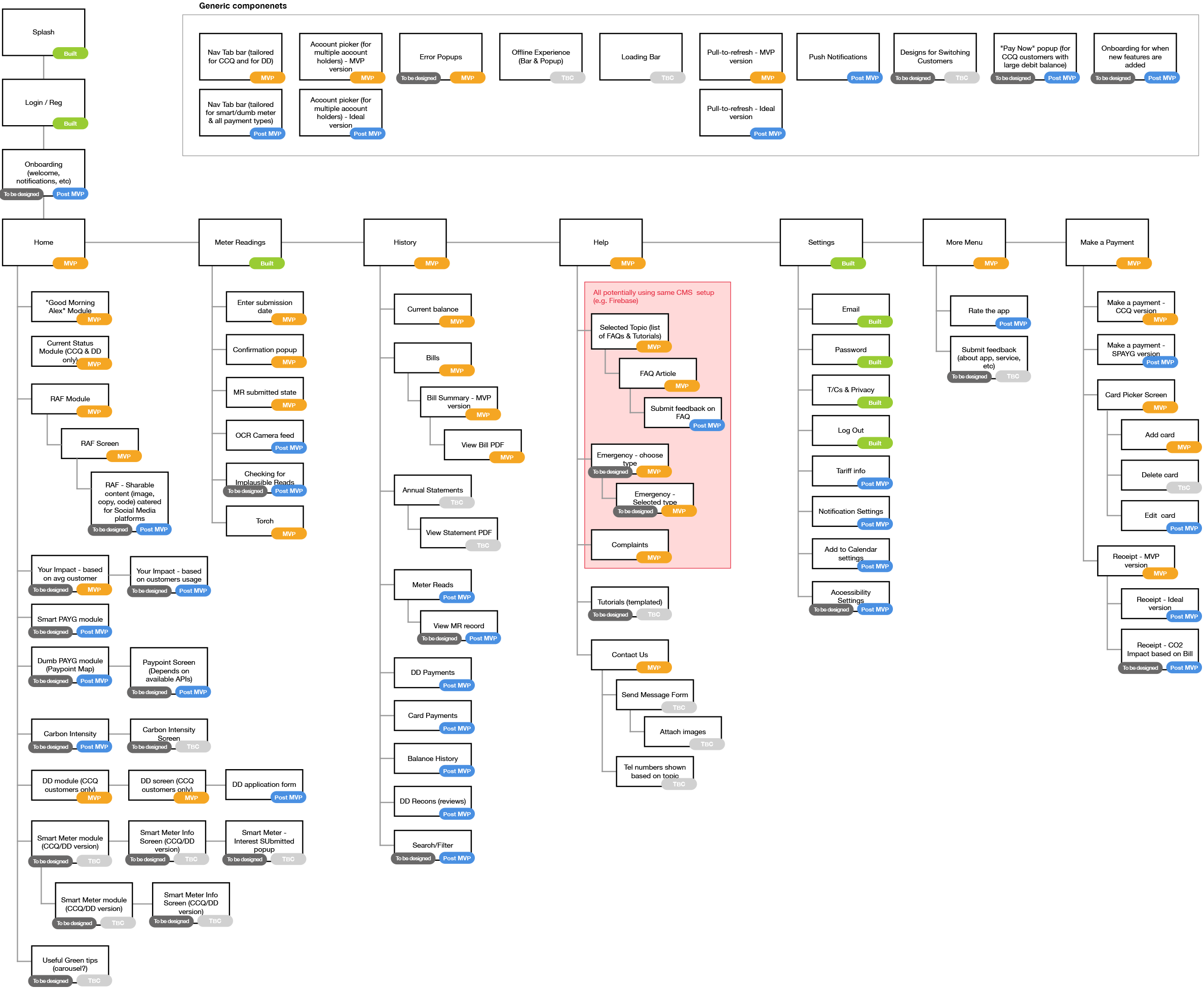
I worked out the sitemap for the new app and consulted with numerous stakeholders and the developer team to establish what should be included for MVP and what would be for post launch. The sitemap also included common components (e.g. popups) and details on dependencies, etc.
Bringing it all together
Look and Feel
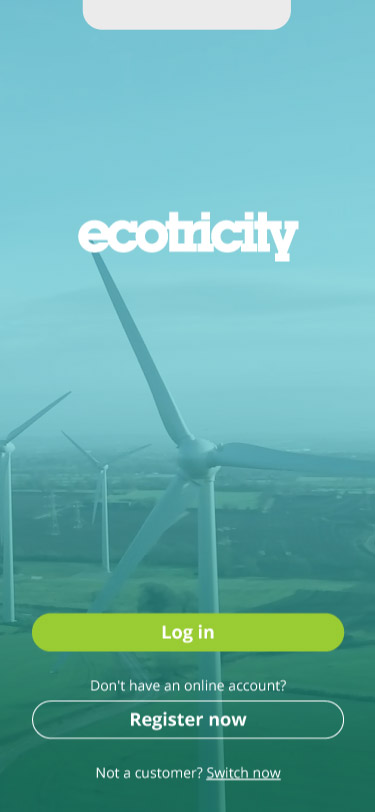
Ecotricity had a firm brand style already on their website. The branding in their marketing and comms had gradually evolved to be more contemporary and smarter over time. Ecotricity wanted this app to be modern and clean, setting the tone for their future digital platforms, but it was important that it was still connected to that of the website. I lead the design of the style of the new app, collaborating with Ecotricity’s design department to create a fresh look and feel that would lead the way for Ecotricity.
Component Library
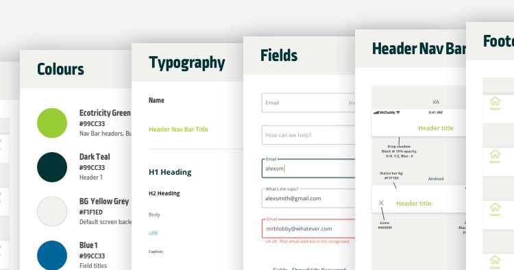
Ecotricity did not yet have a design system in place, so I created a light one along with a component library which included colours, typography, icons and common components such as buttons, inputs, toggles, cards, nav bars, etc.

Key Feature 1 – Get smarter with when to engage the user
One key finding from our research was that most customers only want to be contacted by their energy app if something needs doing. WIth this in mind, I brainstormed how to provide better-timed and smarter communication from the app to the end user. The team and I then looked at the benefit vs effort for these ideas and opted to go with:
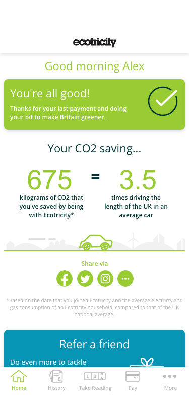
Provide positive confirmation – It’s not just enough to show customers what they need to do… customers also want to be informed when there is nothing they need to do. With this in mind, the home screen of the app was designed so that If the customer doesn’t need to do anything, then a simple “You’re all good” positive confirmation is shown with an obvious reassuring big tick.
Smart Push notifications – Only notifying customers if there is something that the customer needs to do or if something is wrong.
Notification settings – Give customers the option to customize what kind of notifications and communications they receive.
Calendar auto-sync – let the user opt to sync events from their Ecotricity account with the device’s calendar (e.g. for when meter readings or direct debit payments are due, when it’s the most environmental time of the day to use energy in the next 24 hours, etc)

Key Feature 2 – History view
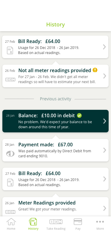
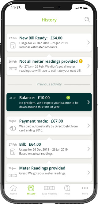
One of the key findings from speaking to Ecotricity’s Customer Service staff was that a lot of customers get confused about how their bills and current balance are calculated. This stems from customers often not knowing what dates past meter readings and payments have been made.
The solution that I came up with was to have a history view section which would be easy for the user to digest and use. It would show:
- the user’s current balance,
- meter readings submissions,
- payments,
- when bills became available (including whether they are based on actual or estimated readings),
- bill cycles (.e. how meter readings and payments feed in to a new balances)
Key Feature 3 – Make bills super simple
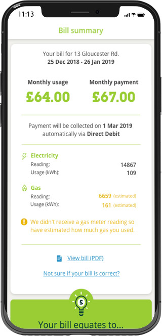
A common pattern emerging from expert interviews and user testing was that customers get very confused by their bills, and they simply want to quickly see what they owe, what period it was for, whether it’s based on actual or estimated readings, and how to pay. So the solution was clear and obvious… provide just that with onward journeys to pay (unless on Direct Debit), to get more info or to get help if needed.
User testing for this proved very popular with all test participants quickly and correctly achieving their tasks and giving glowing feedback along the way.
Key Feature 4 – Improve help systems and push customers to self serve.
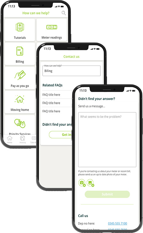
The team and I discovered varoius inefficiencies, problems and un-taped oppurtunities around the help content, experienc and systems used by both customers and Ecotricity call centre staff. The main issues and subsequent solutions included:
Problem 1:
Numerous Ecotricity help content databases meant an increased effort to maintain, and customers and customer service staff often getting inconsistent or outdated help content.
Solution:
Create a new master CMS from which all help content across the company would be served. In addition, bring together Ecotricity’s content team and call centre staff to audit help content and create a new definitive set of content for the new CMS.
Problem 2:
Ecotricity’s customer call centres receiving numerous calls for issues that customers could very easily and quickly resolve themselves. Customers often looking for an Ecotricity number to call as opposed to finding a solution to their problem first. Often a simple photo of a customer’s meter would let customer call staff resolve an issue without the need to speak to the customer.
Solution:
Within the app (and eventually on the website too), push users to:
1. self-help depending on what area of the app they are in (e.g. if they wish to query a bill based on an estimated meter reading, then push them to submit a reading), else…
- if the user wishes to contact Ecotricity, identify what the user needs help with and provide help articles, else…
- push users to send a message (as opposed to calling) and, depending on the type of issue, to request a photo (e.g. of a meter) to help resolve the user’s issue, else…
- show a phone number for the specific team relating to the user’s issue and show estimated call wait time with an option for Ecotritiy to call the customer back.
Problem 3:
Difficult for customers and call centre staff to give feedback on help content.
Solution:
Ensure that the new help content CMS along with the various platforms for showing help content (the app, website, customer call centre system, etc) will allow for users to give feedback on specific help artciles. Create a system whereby feedback is regularly reviewed and used to improve help content.
The Impact
Noticeable benefits since the launch of the app included:
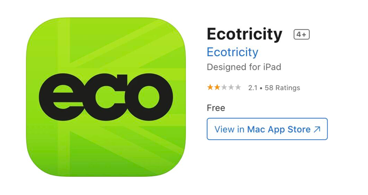
- Significant improvement in app ratings and reviews.
- Reduced number of calls from customers to Ecotricity’s help centre.
- Increase in submitted meter readings via the apps.
- Increase in Ecotricity content on social media.
- Sudden increase in the percentage of customer’s pay by Direct Debit,
- Increased number of customers signing up for a smart-meter,
- Increase in customer referrals,
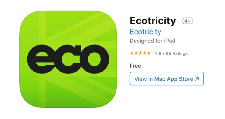
Before Launch
12 months after launch
Learnings
- The UX research and design for this product unearthed insights and simple changes that helped numerous departments and systems across the organisation. My team and I discovered lots of ways to improve efficiencies simply by truly understanding problems and opportunities, taking a step back and connecting dots across the business, not just for the app but for various services that Ecotricity offered too.
- Society is becoming more environmentally aware and green issues are becoming ingrained in what people do in many aspects of their everyday lives.
- It proved invaluable to the business and various stakeholders to see the immediate benefits of using a user-centred design approach to projects. One of my personal aims along the way not just to make a wonderful product, but also to show people the benefits of really great UX and design and inspire them to use these tools and ways of thinking themselves.
